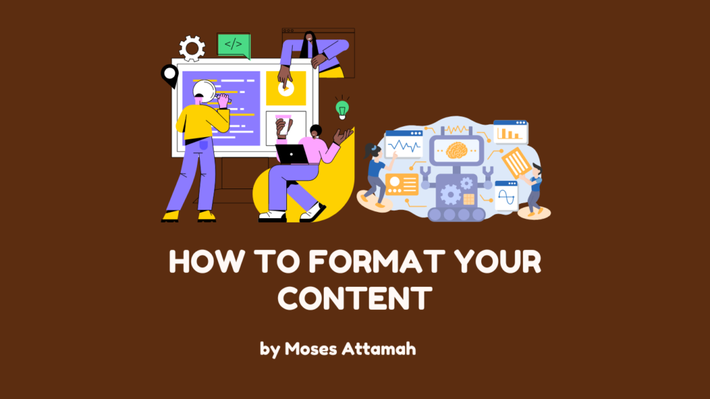
How to Format Your Content Properly And Make It Skimmable in 7 Easy Ways

A HubSpot Statistic reveals that 73% of people skim articles and 27% read them thoroughly.
This shows that most people just glance over the article to get the main points, instead of reading every word.
So, in content writing, formatting your article or blog post properly:
- Ensures it’s readable, engaging, and visually appealing to both your readers and Google.
- And can keep more people interested.
Here’s a guide on how to format your content effectively and make it skimmable.
How to format your content properly
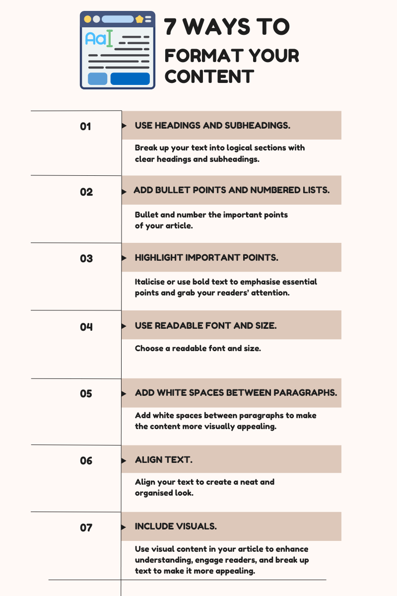
Here are 7 easy and practical strategies to do that (with examples).
- #1. Use headings and subheadings.
- #2. Add bullet points and numbered lists.
- #3. Highlight “extremely important” points.
- #4. Use readable font and size.
- #5. Add white spaces between paragraphs.
- #6. Align text.
- #7. Include visuals.
Let’s jump right into them.
#1. Using headings and subheadings
Here are 3 tips for using headings and subheadings:
I. Break up your text into logical sections with clear headings and subheadings.
Here’s a good example.

The H1, “The benefits of regular exercise,” is the title or headline.
You can only have one H1 in an article.
The H2s are the main headings, while the H3s are the subheadings.
Finally, the normal text falls under the subheadings (H3s).
II. Use the key points as headings and subheadings.
Each main heading or subheading should summarise the key point of the section.
The H2, “Physical health benefits,” summarises the following H3s.

So, it’s easy for readers to see the benefits of physical health by just looking at the subheadings.
III. Use consistent heading font and size.
The headings and subheadings should maintain consistent font and size.
This is to make them visually distinct.

Isn’t that beautiful to behold?
Of course, it is.
So, use levels of headings and subheadings to make your content easier to scan, follow, and understand.
#2. Adding bullet points and numbered lists
Bullet and number the important points of your article.
Here’s an example of bullet points.

For numbered lists, below is an example.

In both examples, the bulleted and numbered lists highlight the key points quickly.
This makes your content more digestible for readers skimming through the article.
#3. Highlighting “extremely important” points
“Reading dense text is no fun because readers struggle to see the most critical points.”
Italicise or use bold text to emphasise essential points and grab your readers’ attention.
This tip is particularly useful when the words are packed closely together.
Look at this text, for instance.

The text is dense and overwhelming to read.
Reading dense text is no fun because readers struggle to see the most critical points.
Now, look at this one.

The main ideas and key takeaways stand out.
Now, readers can easily and quickly
- Skim through the text and see the most relevant points
- And understand the content without being overwhelmed by the details.
Remember: Don’t highlight too much text, as it can overwhelm your readers.
#4. Using readable font and size
Choose a readable font and size.
Avoid using too many different fonts or sizes.
It can make the content difficult to read and distract your readers.
Look at this screenshot below.

Isn’t that distracting?
Now, look at the next screenshot.

So whatever font and size you use, be consistent with them throughout the content.
#5. Adding white spaces between paragraphs
Add white spaces between paragraphs to make the content more visually appealing.
See this example.

The text is overwhelming to read.
Yes.
But let’s see how to make it visually appealing in 3 steps.
I. Identify the paragraphs.
Know where the paragraphs begin and end.
From the example above, we can identify 3 paragraphs.
Paragraph 1

Paragraph 2

Paragraph 3

(Note: Each paragraph should have a distinct idea.)
II. Add a white space.
Once we’ve identified the paragraphs, add a white space between them.
I’ve done that below.

This automatically creates a visual separation between the paragraphs and makes it easier for readers to differentiate between them.
III. Ensure consistent spacing.
To ensure a consistent look, the white spaces between paragraphs should be equal.
This makes the content layout well-arranged.
Here is the final version:

#6. Aligning text
Align your text to create a neat and organised look.
The 4 types of text alignments are
- Left
- Right
- Centre
- And justified.
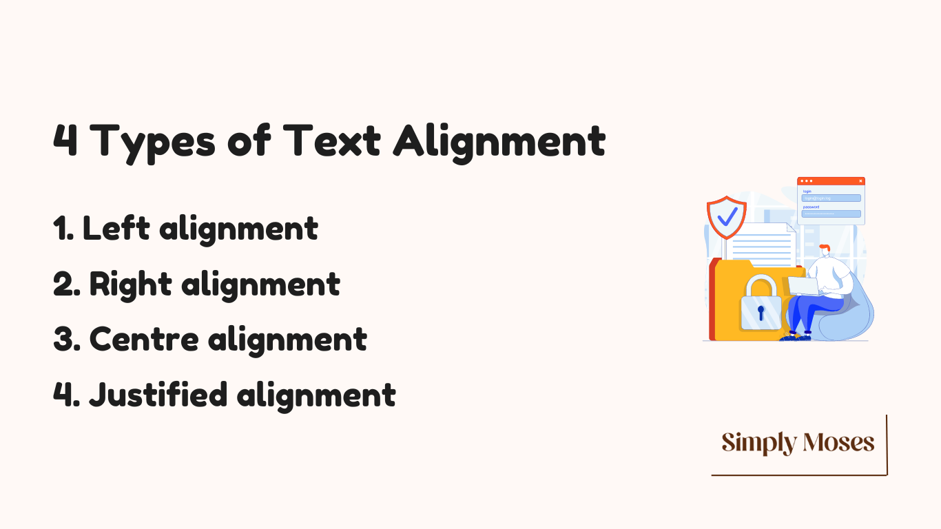
Here’s a simple description of each type and its specific use.
I. Left alignment
Text is lined up on the left side of the page, leaving the right side look messy.

This alignment is used in most forms of writing, such as
- Blog posts and articles
- Reports
- Business letters
- And most online content.
It’s great for writing where readability and a professional look are important to readers.
II. Right alignment
Text is lined up on the right side of the page, leaving the left side look messy.

This alignment is often used for aesthetic purposes, such as in
- Formal invitations
- Resumes
- And in headers or footers for dates and page numbers.
It’s perfect for writing where you want the text to be pleasing to the eye.
III. Centre alignment
Text is centred between the left and right sides of the page, making both edges look messy.

This alignment is commonly used for
- Titles
- Headings
- Poetry
- And formal invitations.
It’s suitable for writing where a balanced visual appearance is most important.
IV. Justified alignment
Text is aligned uniformly on both the left and right sides of the page, creating a clean, block-like appearance.

This alignment is commonly used in
- Newspapers
- Magazines
- And books.
It’s perfect for professional publications and formal documents where a polished and uniform look is essential.
However, it may not be great for online content because of issues with spacing and readability.
How do you choose the best alignment for you?
Choosing the proper alignment depends on:
- The purpose of the content
- The medium (print or digital)
- And the desired visual impact.
Whichever alignment you go for, ensure you’re consistent with it.
#7. Including visual content
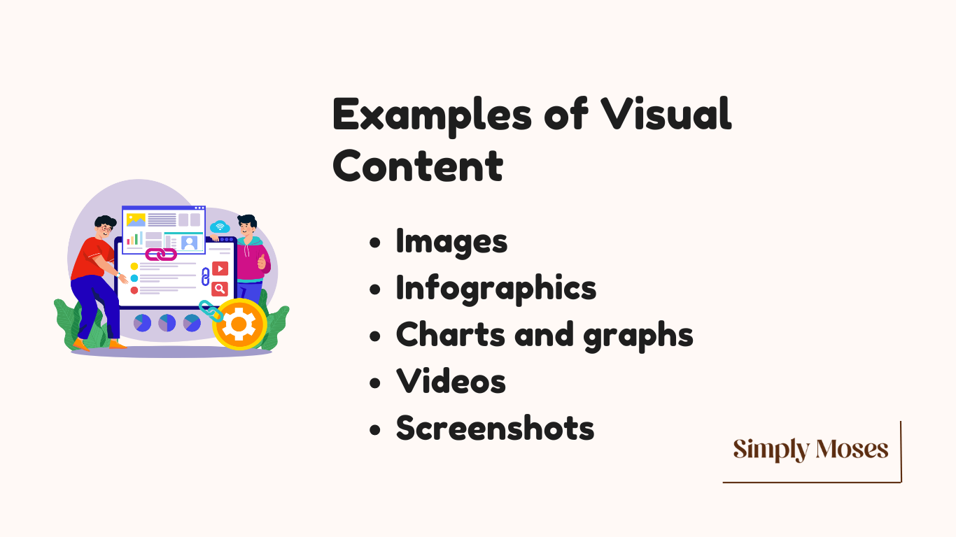
Use visual content in your article to enhance understanding, engage readers, and break up text to make it more appealing.
Here are 5 effective ways to use visuals:
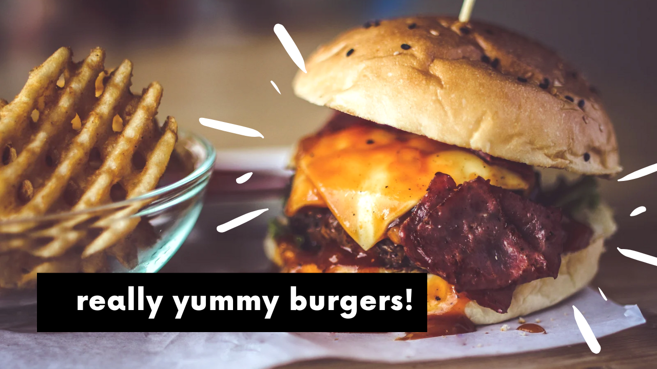
I. Images
Use high-quality images related or relevant to your topic.
For instance:
In a post about burgers, include a colourful image of burgers like this.
Here’s a step-by-step guide for creating an image from scratch.
II. Infographics
Use infographics to show complex information in a visually appealing way.
For instance:
In an article about storytelling, create an infographic summarising the steps for writing a story.
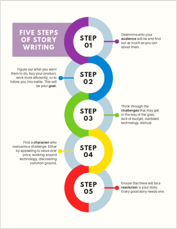
PicMonkey has lots of free infographic templates you can customise.
III. Charts and graphs
Use charts or graphs to represent data or statistics.
For example:
In my article on SEO optimisation strategies, I used this pie chart to present statistics on where all website traffic comes from.

Then here’s a graph showing the same statistics.

(Note: You can also call this a bar chart.)
Charts and graphs are helpful tools that turn numbers and figures into something we can easily see and understand.
Anyway, here’s a guide to help you create charts and graphs.
IV. Videos
Here’s an example of an embedded video:
To learn more, here’s a simple guide on including videos on WordPress.
V. Screenshots
Use screenshots to illustrate your points.
Example:
Here’s a screenshot I took when drafting this article.

You can also include screenshots of relevant social media posts or comments that enhance your article.
Use Snipping Tool for screenshots.
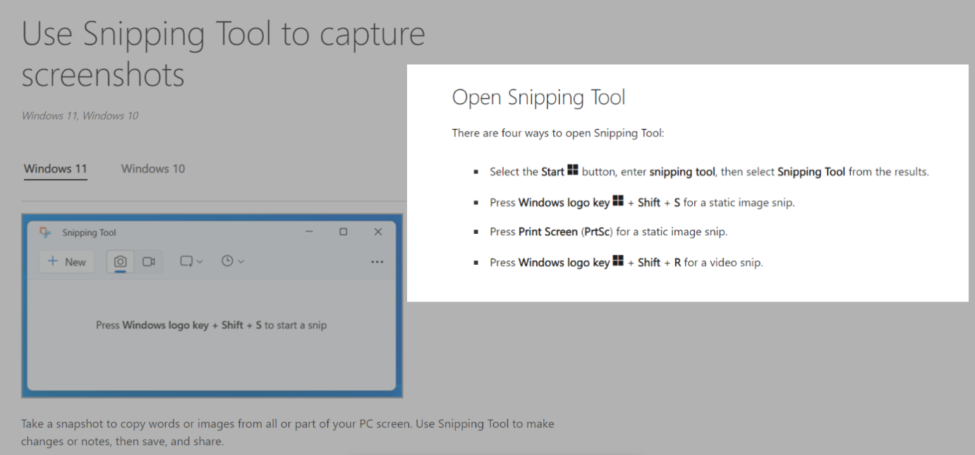
(By the way, I use screenshots a lot in my articles.)
#Bonus — Use quotes with visual backgrounds.
Create images that feature important quotes from your article.
The quotes should have visual backgrounds like this:
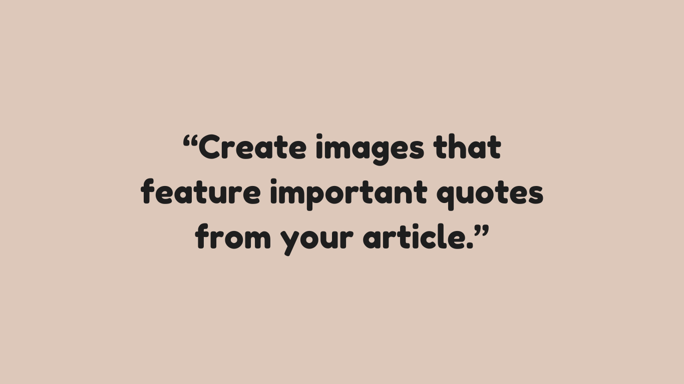
Canva is a good tool for creating this.
Here are tips for using visuals
- Ensure that all visuals relate to the content and add value.
- Use high-quality images and graphics.
- Always include alt text for images for visually impaired readers.
- When using someone else’s designed images or graphics, acknowledge the source properly.
Finally
Applying these formatting techniques helps you improve the readability of your article.
When it’s readable and skimmable, it will be effective and engaging to more readers.
I would love to hear from you
I hope you enjoyed reading this article.
What do you think about it? And was it helpful?
Have any questions for me?
Let me know in the comments now.
Take the next step to start content writing NOW!
If you want personal mentorship, talk with me or send me your questions and concerns here:
- simplymoses25[at]gmail[dot]com (simplymoses25@gmail.com).
Be assured I’ll respond to you within 12 hours.